T-Shirt Visibility Calculator for Ireland
Based on the science of visibility in Irish weather conditions, select a t-shirt color to see its performance ratings across different lighting scenarios.
Visibility Ratings
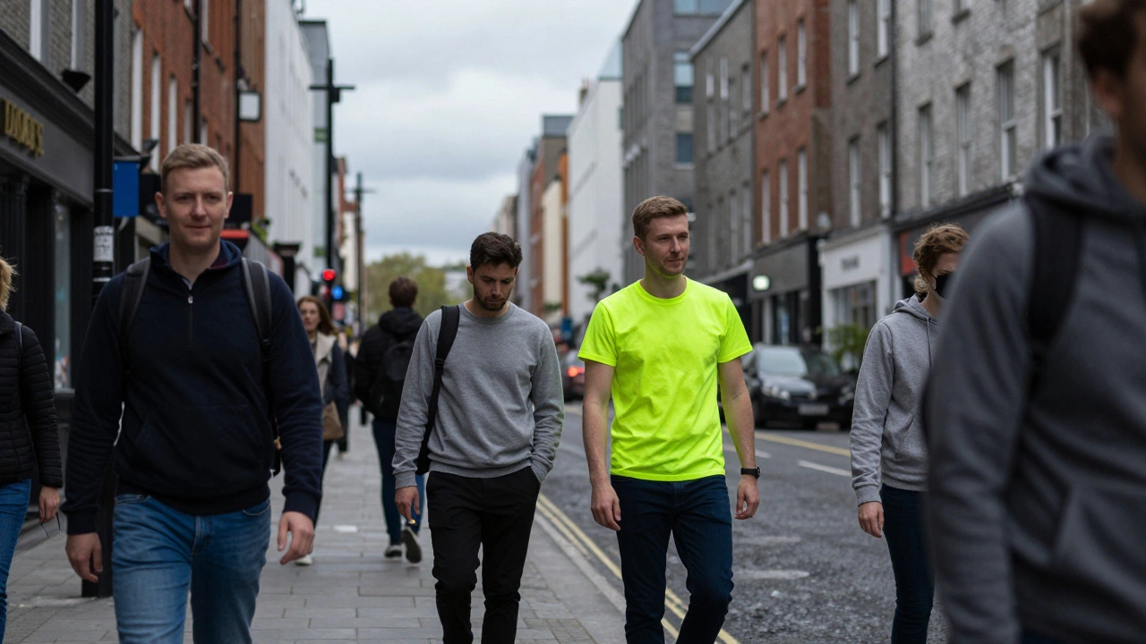
Walk through any crowded street in Dublin, from the bustling Grafton Street to the quieter lanes of Temple Bar, and you’ll notice one thing immediately: certain colors just pop. They grab your attention before you even realize why. If you’re wondering what color catches the human eye the most, especially when it comes to t-shirts and everyday wear in Ireland, the answer isn’t as simple as pointing to a single shade on a rainbow. It’s a mix of biology, physics, and the unique lighting conditions we deal with here on the Emerald Isle.
In Ireland, where overcast skies are a frequent companion and daylight hours shift dramatically between seasons, color perception plays a bigger role in fashion and safety than many people realize. Whether you’re designing a brand identity for a startup in Cork, choosing workwear for a construction site in Galway, or just picking out a summer tee for a trip to the Wild Atlantic Way, understanding how the human eye processes color can make all the difference. Let’s break down the science behind visibility and see how it applies to real-life scenarios across the country.
The Biology of Seeing: Why Some Colors Stand Out
To understand what makes a color visible, we first need to look at how our eyes work. The human retina contains two types of photoreceptor cells: rods and cones. Rods are responsible for vision in low light, while cones handle color vision and detail in bright light. There are three types of cones, each sensitive to different wavelengths of light: short (blue), medium (green), and long (red).
This biological setup means that some colors are naturally more stimulating to our visual system than others. High-wavelength colors like red, orange, and yellow tend to stand out because they require more energy to perceive. In practical terms, this is why emergency vehicles use red and why warning signs often feature bright yellow backgrounds. For t-shirts, this translates into higher visibility for bold, warm tones compared to cooler, muted shades.
However, context matters immensely. A bright red shirt might catch the eye in a crowd wearing neutral tones, but if everyone around you is also wearing vibrant colors, the effect diminishes. This is known as simultaneous contrast, where the surrounding environment influences how we perceive a specific color. In urban centers like Dublin or Belfast, where fashion trends lean towards eclectic mixes, standing out requires more strategic color choices.
The Role of Lighting Conditions in Ireland
Ireland’s weather patterns significantly impact color visibility. With an average of only 130 hours of sunshine per month in winter and frequent cloud cover throughout the year, natural light conditions vary widely. Overcast days diffuse sunlight, reducing shadows and softening contrasts. This diffusion affects how colors appear, making saturated hues less vibrant and pastel shades almost washed out.
During these cloudy periods, high-contrast combinations become crucial for visibility. Think black paired with neon green or white against deep navy blue. These pairings create sharp edges that the eye can easily detect even in dimmer light. Conversely, during rare sunny spells, such as those experienced along the Dingle Peninsula in July, lighter colors reflect more light and appear brighter, enhancing their visibility.
For businesses operating outdoors-whether it’s farmers working fields in County Kerry or cyclists navigating paths in Phoenix Park-understanding these lighting dynamics is essential. Choosing appropriate t-shirt colors ensures both style and safety remain intact regardless of the day’s forecast.
| Color | Sunny Day Visibility | Overcast Day Visibility | Nighttime Visibility (with reflective elements) |
|---|---|---|---|
| Bright Yellow | High | Very High | Medium (requires enhancement) |
| Neon Orange | Very High | High | Low |
| Deep Blue | Medium | Low | Very Low |
| White | High | Medium | Medium (reflective properties help) |
| Black | Low | Very Low | Extremely Low |
Cultural Context: Fashion Trends Across Ireland
Fashion in Ireland reflects a blend of traditional values and modern influences. While cities like Dublin and Cork embrace global trends, rural areas often maintain a preference for classic, understated styles. This cultural divide impacts color choices for t-shirts and other apparel. Urban dwellers may experiment with bold prints and unconventional palettes, whereas those in smaller towns might stick to timeless neutrals.
Seasonal events also play a significant role. During St. Patrick’s Day celebrations nationwide, green becomes ubiquitous, symbolizing national pride and unity. However, outside of festive occasions, greens are less common in everyday wardrobes due to their association primarily with holidays rather than daily life. Similarly, purple has gained popularity recently among younger demographics influenced by social media platforms, yet it remains niche overall.
Local brands recognize these nuances when developing collections. Companies based in Limerick or Waterford tailor product lines accordingly, ensuring relevance within target markets. By aligning offerings with regional preferences, they increase sales potential while fostering community connections.
Practical Applications: From Safety Gear to Marketing Strategies
Beyond personal style considerations, knowledge about color visibility holds immense value for industries reliant on worker safety. Construction sites scattered across counties require employees to wear highly visible clothing to prevent accidents. Here, fluorescent yellows and oranges dominate due to their ability to cut through foggy mornings typical in coastal regions like Donegal or Mayo.
Marketing professionals likewise leverage this insight effectively. When launching campaigns aimed at capturing consumer interest quickly, advertisers opt for eye-catching visuals featuring dominant colors identified earlier. Retail stores located near tourist hotspots such as Cliffs of Moher utilize bright signage incorporating optimal hues to attract passing visitors eager to explore local attractions.
Even sports teams consider visibility factors when selecting kit designs. Football clubs competing under floodlights benefit greatly from contrasting jerseys allowing spectators seated far away still identify players clearly. Teams playing home games at Aviva Stadium take advantage of controlled environments optimizing team colors accordingly.
Choosing the Right T-Shirt Color Based on Your Goals
Selecting the perfect t-shirt color depends largely upon intended purpose. Are you aiming to blend seamlessly into casual settings or command attention wherever you go? Each scenario calls for distinct approaches guided by principles discussed thus far.
- For Everyday Wear: Stick with versatile basics like grey, beige, or light blue which complement various outfits without overwhelming them.
- For Outdoor Activities: Prioritize high-visibility options including neon pink, lime green, or electric blue ensuring maximum exposure amidst nature's backdrop.
- For Professional Settings: Opt for subdued tones such as charcoal gray, forest green, or burgundy projecting confidence alongside professionalism.
- For Creative Expressions: Experiment freely mixing unexpected combos like teal paired with mustard yellow showcasing individuality boldly.
Remember too that fabric texture influences perceived brightness subtly altering final outcomes. Matte finishes absorb light differently than glossy surfaces affecting overall appearance considerably.
Troubleshooting Common Issues Related to Color Perception
Sometimes despite best efforts chosen colors fail deliver expected results leaving individuals frustrated wondering what went wrong. Below listed several troubleshooting tips addressing frequent challenges encountered:
- Poor Contrast Against Backgrounds: Ensure sufficient difference exists between foreground object (yourself) versus surroundings avoiding camouflage effects unintentionally created.
- Inadequate Lighting Support: Supplement ambient illumination artificially whenever possible boosting effectiveness inherently limited natural sources alone provide insufficiently.
- Mismatched Expectations Versus Reality: Test samples beforehand verifying actual performance matches theoretical predictions made initially based solely online research conducted previously.
- Ignoring Audience Preferences: Conduct surveys gathering feedback directly from consumers learning firsthand insights valuable shaping future decisions positively impacting success rates achieved subsequently.
By implementing corrective measures outlined above users gain greater control achieving desired goals efficiently minimizing trial-and-error cycles unnecessarily prolonged otherwise.
Is yellow really the most visible color?
Yes, bright yellow is generally considered the most visible color to the human eye, especially in daylight conditions. Its high wavelength stimulates cone cells strongly, making it stand out against most backgrounds. In Ireland, this is particularly useful for outdoor activities given the variable weather.
How does overcast weather affect color visibility?
Overcast weather diffuses sunlight, reducing contrast and saturation levels. As a result, darker colors lose depth while lighter ones appear duller. To compensate, choose high-contrast combinations or incorporate reflective materials into your attire for better visibility during cloudy days common in Ireland.
What colors should I avoid for nighttime visibility?
Avoid dark colors like black, navy blue, and deep brown for nighttime visibility since they absorb available light rather than reflecting it. Instead, select lighter shades enhanced with reflective strips designed specifically for low-light environments ensuring safer navigation after sunset.
Can cultural preferences influence color choice?
Absolutely. Cultural norms shape aesthetic judgments profoundly affecting acceptance levels associated particular hues. For instance, green dominates Irish festivities celebrating heritage annually yet rarely appears elsewhere unless tied explicitly thematic contexts requiring symbolic representation accordingly.
Are there any tools available to test color visibility?
Several digital applications simulate lighting conditions helping predict how selected colors will perform realistically under varying circumstances. Additionally physical testing involving mock setups replicating target environments provides hands-on experience validating assumptions formed theoretically beforehand comprehensively.